This is an update on my previous blog on visual literacy. For me, I think that high quality communication is key in every aspect of life, personal and professional, this post includes some thoughts, some references and some examples.
Why? 1) I'm interested in learning, and technology and change; 2) I'm active in teaching and researching learning technology and change
that means that I spend quite a lot of time thinking about what is happening, and trying to make sense of the evidence I find,
I have a set of visualisation tools I regularly use and thought it would be good to learn their proper names and actually categorise them
I was prompted to do this by a variety of experiences, but primarily one excellent resource (the periodic table of visualisation methods) and numerous bad experiences of me, my colleagues and students presenting information in unintelligible ways
Making Sense - Visualisation as a tool for thinking
cut a bit of slack here, using the wrong tool is sometimes ok, because its about a work in progress, making sense of your information and trying to find ways of understanding and communicating what you have found. After all playing with different sorts of visualisations will give you personal experience on which you can refine your understanding.
Communicating Understanding - Visualisation as a tool for talking
when we want to enter into a discourse about our understanding, then finding the best way to present information to afford that discourse is quite useful
while I am doing that, I would like to quote Tufte's observation "Graphical excellence is that which gives to the viewer the greatest number of ideas in the shortest time with the least ink in the smallest space"
So....
Data Visualisation
Expressing ideas in terms of visualisation can be a powerful tool for deepening your own understanding, and also for communicating new ideas.
Visualisations can range from the strictly factual (e.g. a graph derived from a set of data) through to ideographic (explaining the perceived inter-relationship between sets of ideas and concepts)
In some ways a table which summarises analysis of artefacts (a set of reviewed software or a set of reviewed papers) can be seen as a type of visualisation.
Visualisations can help save words in written reports, and can also be used to help structure an argument in a paper or a visual presentation. Most importantly they can contribute effectively to the communication of ideas, stimulating debate and disseminating understanding.
References
A few references for visualisations are listed below:
- Tufte, E. R. (1983) The visual display of quantitative information, Cambridge, MA, Graphical Press LLC. You can find out more about Tutfe's work via his web site http://www.edwardtufte.com/tufte/
- Lengler R., Eppler M. (2007). Towards A Periodic Table of Visualization Methods for Management. IASTED Proceedings of the Conference on Graphics and Visualization in Engineering (GVE 2007), Clearwater, Florida, USA. Paper which describes this work
- http://www.visual-literacy.org is the website which is associated with Lenger and Eppler's work. You can find the Periodic Table of Methods of Visualisation, which is an interactive web page with illustrative popup of each of the visualisation methods identified, at
http://www.visual-literacy.org/periodic_table/periodic_table.html
Tools List
Periodic Table of Methods of Visualisation categorises visualisations into six broad types.
- Data
- Information
- Concept
- Strategy
- Metaphor
- Compound
This post looks at visualisation methods which I have found useful and relevant to my academic activities, either for research or for marshalling arguments and explanations either for teaching or explaining my understandings to friends and colleagues. It is interesting to consider this collection of methods against the repertoire of methods which are routinely used in particular disciplines (e.g. Computer Science and Management) In some cases, where such methods have been specifically designed to communicate a formal development process, or to document and subsequently manage a development process there is a stronger degree of literality and rigour, than might be found in some of the conceptual methods/thinking tools such as mind maps.
- One interesting role which has emerged out of the field of graphic visualisations is that of the graphic facilitator.
- Methods such as graphics cafes are also interesting.
Data Visualisation
These visualisations provide a direct mapping between the information which is presented, and the data which was collected and analysed.
Basic visualisations which most students produce include tables, graphs, histograms, pie charts, and magic quadrants. They are probably the most common visualisations which you will find in published papers. Often we are as more constrained by our medium of presentation (eg double column journal pages) that we are by the objective of clear communication.
Tables, Pie Charts and stuff
This is data representation, there is a one to one relationship between the data and the representation. With tables we can choose information, and communicate our undertanding by the location of information, we may also gain by putting a lot of data in one place, which people can use as a signpost, when they then follow an explanation through the text.
Concept Visualisations
I am particularly interested in concept visualisations because I am intersted in the communication of ideas - when we speculate and theories we are dealing in the conceptual. Some visualisation methods are more rigorous than others being associated with specific research practices' accepted analytical methods. Others function as thinking tools, which represent incomplete (or not yet complete) representations of understandings.
Concept Map
This is a formal modelling tool commonly used for knowledge representation and ontology creation.
Mind Map
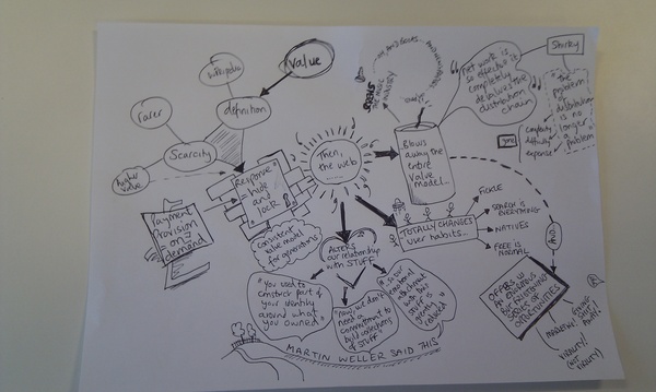 This MindMap from Flickr courtesy of Mike Ellis from http://electronicmuseum.org.uk . The mindmap approach was designed originally and championed by Tony Buzan. Mind mapping is a thinking tool which can also be used for formally to record information spaces and to manage workflows. Its worth looking at the Buzan web site as a follow up, mindmaps may be drawn by hand or using software, and there are many tools available which can be used to create mind maps on computers. The diagram linked from in the Radar Diagram (below) provides an interactive snapshop of mapping software
you probably already know about the following, but do some web searching if you are in doubt!
This MindMap from Flickr courtesy of Mike Ellis from http://electronicmuseum.org.uk . The mindmap approach was designed originally and championed by Tony Buzan. Mind mapping is a thinking tool which can also be used for formally to record information spaces and to manage workflows. Its worth looking at the Buzan web site as a follow up, mindmaps may be drawn by hand or using software, and there are many tools available which can be used to create mind maps on computers. The diagram linked from in the Radar Diagram (below) provides an interactive snapshop of mapping software
you probably already know about the following, but do some web searching if you are in doubt!
- Venn Diagram
- Cluster Diagram
- Layer Chart
- Concentric Circles
Radar
from http://www.visual-literacy.org/pages/maps/mapping_tools_radar/radar.html
Compound Visualisations:
According to the visualisation periodic table, there are six types of compound visualisations - although I think that if you go to Tufte he identifies quite a few which have been generated with firm mappings to their data source.
Knowledge Map
These are basically hypothetical maps (often in the style of maps created by early mariners) which seek to demonstrate the 'landscape'. They also remind me in style of maps which accompany books like The Lord of the Rings and Swallows and Amazons.
You probably need a great deal of imagination to create a convincing knowledge map, but they can be highly persuasive and powerful in communicating an overview of content and issues in a particular area.
I find label knowledge maps a little misleading, and wonder if mythical maps, or metaphor maps might be more accurate. To me the term knowledge implies a degree of certainty and finality which I do not think is actually communicated in the final product.
I have come across a couple of knowledge maps which are probably of interest to folks in my research area.
Knowledge Map
Permanent link to this comic: http://xkcd.com/256/
Image URL (for hotlinking/embedding): http://imgs.xkcd.com/comics/online_communities_small.png
eLearnland
Learning Map
early work in this area was done by companies seeking to explain the intricacies of their organisaiton. Probably the most famous is the work done by Pepsi on Beverage Street. There is a paper which explores this work The Learning Map Approach by James Haudan and Christy Contardi Stone, a white paper published in The Change Handbook, Peggy Holman, Tom Devane and Stevan Caddy. Here the approach is one of metaphor rather than formal modelling, although it may be possible to incorporate meaning via metaphor, such as sense of proximity and distance, known and unknown.
from http://elearningargentina.files.wordpress.com/2008/03/informal-learning.jpg
Underground Map
This is called a metro map by the folks at visual-lliteracy.org, but since the original map (a visualisation which depicts conections and interconnections, but priviledges this over scale accuracy) was designed for the London Underground, I think it is more accurate and respectful to call it an Underground Map - the paris metro map is a totally different beast!
This example visualisation of Web Trends was produced in 2007 by Otto Nassar (version 2)
"The map has been featured all across the web from .... The Web Trend Map plots the Internet’s leading names and domains onto the Tokyo Metro map. Domains and personalities are carefully selected through dialogue with map enthusiasts, and every domain is evaluated based on traffic, revenue, and character. "
Version 4 - a rather different beast is shown below
Other Stuff
Information is Beautiful
rather fabulous site to browse to gather ideas and models of information graphics
Colorschemer
visualising words and their semantic interconnections
tag cloud
just as you see on the left of this post, it offers both a mapping and a compact visual analysis of the information
"Wordle is a toy for generating “word clouds” from text that you provide. The clouds give greater prominence to words that appear more frequently in the source text. You can tweak your clouds with different fonts, layouts, and color schemes. The images you create with Wordle are yours to use however you like. You can print them out, or save them to the Wordle gallery to share with your friends".
Gallery of Data Visualization - the best and worst of statistical graphics
Gapminder is an online visualisation tool. It works with a collection of provided data sets, useful for getting an idea of what visualisations might look like.
visualcomplexity.com is a website which provides an index into many different visualisation methods and tools
The last time I looked, the main categories of visualisation were
Art (62)
Biology (50)
Business Networks (25)
Computer Systems (29)
Food Webs (7)
Internet (30)
Knowledge Networks (105)
Multi-Domain Representation (60)
Music (33)
Others (59)
Pattern Recognition (24)
Political Networks (20)
Semantic Networks (30)
Social Networks (89)
Transportation Networks (45)
World Wide Web (55)
Further reading
-->
Trochim, W. Reliability of Concept Mapping. Paper presented at the Annual Conference of the American Evaluation Association, Dallas, Texas, November, 1993.
Tukey, John W (1977). Exploratory Data Analysis. Addison-Wesley. ISBN 0-201-07616-0. OCLC 3058187.



 CC BY-NC-SA 3.0 UK



 Posts
Posts


