Monday 21 June 2010

How linked data will benefit higher education

I have been having a bit of fun preparing for a presentation to the ALPSP for a day long event titled Ready for Web 3.0.

The presentation I made ties in with our work on the Southampton Learning Environment and my personal take on Rich Learning Environments. You can take a look at the slides and check out the main refs below :-)

Abstract:

The potential impact of widespread use of linked-data in Higher Education is immense. Everyday understandings of the power derived by placing raw data in the public domain is growing. It promises to transform education, interconnecting administrative data, enriching and embellishing teaching resources while providing tools and resources for learners and researchers alike.


Refs

you might like to read what Tim Berners Lee has to say on some of the Design Issues

Tim Berners Lee - Design Issues: Linked Data http://www.w3.org/DesignIssues/LinkedData

Tim Berners Lee on the Next Web A TED talk from tbl (2009) - the "Raw Data Now" talk

From WC3 - a quick introduction to linked data Linked Data intro from WC3 on Slideshare

Interlinking with DBPedia http://wiki.dbpedia.org/Interlinking


Tiropanis, T., Davis, H., Millard, D., Weal, M., White, S. and Wills, G. (2009) Semantic Technologies in Learning and Teaching (SemTech) - JISC Report
http://www.jisc.ac.uk/whatwedo/projects/semantictechnologies.aspx


Paul Miller (2010) Linked Data Horizon Scan – JISC report
http://linkeddata.jiscpress.org/

Paul Miller's Blog http://cloudofdata.com/

XCRI project http://www.xcri.org/Welcome.html

RDFa

MySociety
http://www.mysociety.org/

data.gov http://data.gov.uk/apps

The Semantic Squirrel http://www.ploscompbiol.org/doi/pcbi.1000361

Tiropanis Thanassis , Davis, H., Millard, D., Weal, M., White, S. and Wills, G. (2009) Semantic Technologies in Learning and Teaching (SemTech) - JISC Report

http://semtech.ecs.soton.ac.uk/

White, S., Davis, H. C., Morris, D. and Hancock, P. (2010) Making it rich and personal: meeting institutional challenges from next generation learning environments. In: The PLE conference 2010, 8-9 July 2010

http://eprints.ecs.soton.ac.uk/21327/


Thursday 17 June 2010

visual thinking - maps and clouds

Given the overheads of putting all the images in one post, I am creating sub posts.
This one is maps and clouds

What is emerging is a continuum of visualisations from static through to dynamic, and from models through to metaphors ( sounds like a target for a magic quadrant visualization ;-)

the map below is a visualisation which incorporates real information - the colours and interconnections both explain relationships which exist with the data.


LODCloud.png


Its a map which is quite often come across - a visualisation of the Links of Data (LOD) as a cloud. The image owes its source to Christian Bizer from Berlin. The date on this diagram is July 2009. May be worth visiting the original source to check out any updates.


Also here is a further visualisation of web trends, another hybrid visualisation which is towards the model end of the spectrum.

Thursday 10 June 2010

Visual Thinking continued - graphic facilitation and recording

I come across the idea of graphic facilitation or graphic recording following up the work on Learning Maps which appears on the periodic table of visualisations.

Picture 30.png


The learning map featured on the periodic table is Pepsi's The Revolution on Beverage Street (left) - which was developed to represent the supply chain activities for that company.

It seemed to me that representing the dynamics of emerging discussions, conclusions and thinking might sometimes be more usefully represented visually rather than in the usual textual report and proceedings format - or at least the two methods might complement each other.

I am a keen proponent of mindmaps for my own use, and can use them to record information, but I am really not much of an artist, and so looking at the work of specialist graphic designers and artists in this respect in interesting. Hope to have some (almost) first hand experience of graphic recording very soon, meanwhile why not take a look at some of the links?

Other intersting folk in the area include - Thinking Visually http://www.thinkingvisually.com/graphic.html

http://www.flickr.com/photos/thinkingvisually

They are sort of related to the analytical work you find from Davis McCandless http://www.davidmccandless.com/ who writes for the Guardian Datablog.

Information is Beautiful

Picture 32.png
David hosts the Information is Beautiful website which arose from the book of the same name http://www.informationisbeautiful.net/ )

He works with ( and praises) Steanie Posavec (who is with Norcot) http://www.notcot.com/archives/2008/04/stefanie-posave.php .

Her work with Jack Kerouacs on the Road - analysis and visualisations is something to behold, and might even be of interest to hypertext buffs.

Companies who do graphical recording/facilitation

Picture 31.png


Graphic Change is a UK company who do graphic facilitation. You can use graphic facilitators to come along to your meeting and act as visual scribes.I am full of admiration for the skill they must apply. Its interesting to consider how they evolve/emerge their images.

I assume that graphic facilitators have a particularly rich visual vocabulary which combined with an understanding of the language of pictures enables them to construct visuals in this way


Wednesday 9 June 2010

readings: technology enhanced learning

If you are looking to understand where some of my current ideas on TEL and Rich Learning Environments are coming from you might like to look at the following foundational texts and papers. Mostly they are not especially recent, but they do provide a framework for understanding.
The important thing is to look at the beginnings and then consider how these ideas and approaches have been developed in the future. It may also be worth looking at the most recent edition of any work and finding out from the introductions how and why the revisions have been made.


ANDERSON, L. W., KRATHWOHL, D. R., AIRASIAN, P. W. & CRUIKSHANK, K. A. (Eds.) (2001) A Taxonomy for Learning, Teaching, and Assessing: A Revision of Bloom's Taxonomy of Educational Objectives, New York : Longman
BEETHAM, H. & SHARPE, R. (Eds) (2007) Rethinking pedagogy for a digital age. Oxford: Routledge, Falmer
BIGGS, J. (2003) Teaching for Quality Learning at University, Maidenhead, Society for Research into Higher Education/Open University Press.

BLOOM, B. S. (1956) Taxonomy of educational objectives; the classification of educational goals, New York, Longmans.

BLOOM, B. S. (1984) The 2 sigma problem: The search for methods of group instruction as effective as one-to-one tutoring. Educational Researcher, 133-16.

GAVER, W. W. (1991) Technology affordances. Proceedings of the SIGCHI conference on Human factors in computing systems: Reaching through technology. New Orleans, ACM Press.

GAVER, W. W. (1996) Situating Action ii: Affordances for interaction: The social is material for design. Ecological Psychology, 8111-130.

JONASSON, D. H., MAYES, J. T. & MCALEESE, R. (1993) A manifesto for a constructivist approach to uses of technology in higher education. IN DUFFY, T. M., LOWYCK, J. & JONASSEN, D. H. (Eds.) Designing Environments for Constructivist Learning. Berlin, Springer Verlag.

LAURILLARD, D. (1993) Rethinking University Teaching: a Framework for the Effective Use of Educational Technology, London, Routledge.
this work spawned a wide range of approaches to TEL which incorporated or developed the conversational model of learning
LAVÉ, J. & WENGER, E. (1991) Situated learning: legitimate peripheral participation Cambridge University Press
this was first published in 1990 as a report from the Institute for Research on Learning report 90-0013
MARTON, F. & SÄLJÖ, R. (1894) Approaches to learning. IN MARTON, F., HOUNSELL, D. & ENTWISTLE, N. (Eds.) The experience of learning. Edinburgh, Scottish Academic Press.

MAYES, J. T. (1995) Learning Technology and Groundhog Day. IN STRANG, W., SIMPSON, V. & SLATER, D. (Eds.) Hypermedia at Work: Practice and Theory in Higher Education. University of Kent at Canterbury, University of Kent at Canterbury.

MAYES, T. & de FREITAS, S.  (2006) Review of e-learning theories, frameworks and models JISC e-Learning Models Desk Study. Bristol, JISC.

O'REILLY, T. (2005) What Is Web 2.0 – Design Patterns and Business Models for the Next Generation of Software http://oreilly.com/web2/archive/what-is-web-20.html.

O'REILLY, T. ( 2007) What is Web 2.0: Design Patterns and Business Models for the Next Generation of Software. Communications & Strategies, 1: First Quarter 2007,17.

readings: Modified Delphi Technique

Delphi technique goes back to the Rand Corporation in the US just post 1939-1945 war, although I guess the reference to the original delpi (the ancient greek oracle) is indicative of the roots of this approach.

There is an intersting paper which exemplifies an early(ish) application of the modified delphi in the context of higher education.

Alfred R Hecht, A Modified Delphi Technique for Obtaining Consensus on Institutional Research Priorities. Research Brief. Paper presented at the Annual Meeting of the North Central Region AERA Special Interest Group on Community College Research, July, 1977
http://eric.ed.gov/ERICWebPortal/contentdelivery/servlet/ERICServlet?accno=ED140912

The paper is rather old, but reads quite well and is clear. Additionally its quite instructive to read a 1977 paper and see what it looks like! personally, I love the way that people like ERIC and ACM Digital Library are making digitisations of older papers available as PDF images.

As a more recent  (tho' still fairly old) paper which is relevant to modern day applications
Custer et all 1999 is useful JVTE v15n2: The Modified Delphi Technique - A Rotational Modification

The wikipedia ref is OK but probably not helpful to the typical undergrad working on a project.

Linstone and Turrof’s book is online (for which some of the chapters may be useful, but which is probably a bit too much for you to read http://www.is.njit.edu/pubs/delphibook/

Why use the modified Delphi?
  • Basically focus groups can be problematic
  • Members can skew the responses by influencing group dynamics
Delphi and modified delphi is also sometimes knows as quick consultancy

A useful brief account of the technique can be found in A Handbook of Techniques for Formative Evaluation By Judith W. George, John Cowan
  • It is possible to run it in either entirely remotely with deadlines on the voting and responses
  • Or to run it partly electronically and partly face to face, where you do the setup electronically, but then go through the consultation in a group in a fairly short time. 
  • Its a very efficient approach to get a good volume of evaluation data
Also worth considering - Nominal Group Technique - see wikipedia entry as a starting point

I plan to put some more info on my blog elaborating ways to use the approach, which will include a growing set of refs. You may also want to look at the TELUSS project

I would be interested in a student project to develop a tool to manage all the stages of the process of a modified delphi technique

Rich Learning Environments - what do they mean

Picture 28.png
This post revisits some of the discussions from previous posts which looked at a definition of rich learning environments
I would like to set it in the context of changes which continue to take place as the use of technology in everyday life.

My previous post Rich Learning Environments laid out a basic framework for our emerging understanding of the needs and behaviours of existing students and learners.

What is in the background?


Affordances Perspective


Any discussion of technology for learning to my mind has to start with Gaver and a consideration of what (not necessarily intended) consequences the presence, use and availability

Picture 29.png

Affordances of Web 2.0 and the Social Web


Another reference point of which we can usefully be aware, was the definition of Web2.0 which O' Reilly initially addressed at conferences, workshops and through blog publications - and which was subsequently published

What is interesting here is that we can think about Rich Learning Environments as realising all of the core features which O'Reilly associates with Web2.0

• the web as a platform

• you control your own data

• services not packaged software

• architecture of participation

• cost-effective scalability

• re-mixable data source and data transformations

• software above the level of a single device

• harnessing collective intelligence


Picture 39.png


http://oreilly.com/web2/archive/what-is-web-20.html#mememap


A little bit of Education


A recent interesting view which has been developed by school teacher Andrew Church in New Zealand, is an eduationalist's perspective ( termed 'Bloom's Digital Taxonomy' ) which considers the impact or affordances of technology which have recently come into use.


References


GAVER, W. W. (1991) Technology affordances. Proceedings of the SIGCHI conference on Human factors in computing systems: Reaching through technology. New Orleans, ACM Press.

GAVER, W. W. (1996) Situating Action ii: Affordances for interaction: The social is material for design. Ecological Psychology, 8111-130.

O'REILLY, T. (2005). What Is Web 2.0 – Design Patterns and Business Models for the Next Generation of Software http://oreilly.com/web2/archive/what-is-web-20.html. last accessed June 2010


O'REILLY, T. ( 2007) What is Web 2.0: Design Patterns and Business Models for the Next Generation of Software. Communications & Strategies, 1: First Quarter 2007,17. http://papers.ssrn.com/sol3/papers.cfm?abstract_id=1008839 last accessed June 2010

Tuesday 8 June 2010

Visual Thinking Revisited


This is an update on my previous blog on visual literacy. For me, I think that high quality communication is key in every aspect of life, personal and professional, this post includes some thoughts, some references and some examples.

Why? 1) I'm interested in learning, and technology and change; 2) I'm active in teaching and researching learning technology and change

that means that I spend quite a lot of time thinking about what is happening, and trying to make sense of the evidence I find,
I have a set of visualisation tools I regularly use and thought it would be good to learn their proper names and actually categorise them

I was prompted to do this by a variety of experiences, but primarily one excellent resource (the periodic table of visualisation methods) and numerous bad experiences of me, my colleagues and students presenting information in unintelligible ways

Making Sense - Visualisation as a tool for thinking

cut a bit of slack here, using the wrong tool is sometimes ok, because its about a work in progress, making sense of your information and trying to find ways of understanding and communicating what you have found. After all playing with different sorts of visualisations will give you personal experience on which you can refine your understanding.

Communicating Understanding - Visualisation as a tool for talking

when we want to enter into a discourse about our understanding, then finding the best way to present information to afford that discourse is quite useful

while I am doing that, I would like to quote Tufte's observation "Graphical excellence is that which gives to the viewer the greatest number of ideas in the shortest time with the least ink in the smallest space"

So....

Data Visualisation

Expressing ideas in terms of visualisation can be a powerful tool for deepening your own understanding, and also for communicating new ideas.
Visualisations can range from the strictly factual (e.g. a graph derived from a set of data) through to ideographic (explaining the perceived inter-relationship between sets of ideas and concepts)
In some ways a table which summarises analysis of artefacts (a set of reviewed software or a set of reviewed papers) can be seen as a type of visualisation.

Visualisations can help save words in written reports, and can also be used to help structure an argument in a paper or a visual presentation. Most importantly they can contribute effectively to the communication of ideas, stimulating debate and disseminating understanding.

References

A few references for visualisations are listed below:


Tools List

Periodic Table of Methods of Visualisation categorises visualisations into six broad types.
  • Data
  • Information
  • Concept
  • Strategy
  • Metaphor
  • Compound
This post looks at visualisation methods which I have found useful and relevant to my academic activities, either for research or for marshalling arguments and explanations either for teaching or explaining my understandings to friends and colleagues. It is interesting to consider this collection of methods against the repertoire of methods which are routinely used in particular disciplines (e.g. Computer Science and Management) In some cases, where such methods have been specifically designed to communicate a formal development process, or to document and subsequently manage a development process there is a stronger degree of literality and rigour, than might be found in some of the conceptual methods/thinking tools such as mind maps.
  • One interesting role which has emerged out of the field of graphic visualisations is that of the graphic facilitator.
  • Methods such as graphics cafes are also interesting.
Data Visualisation

These visualisations provide a direct mapping between the information which is presented, and the data which was collected and analysed.

Basic visualisations which most students  produce include tables, graphs, histograms, pie charts, and magic quadrants.  They are probably the most common visualisations which you will find in published papers. Often we are as more constrained by our medium of presentation (eg double column journal pages) that we are by the objective of clear communication.


Tables, Pie Charts and stuff

This is data representation, there is a one to one relationship between the data and the representation. With tables we can choose information, and communicate our undertanding by the location of information, we may also gain by putting a lot of data in one place, which people can use as a signpost, when they then follow an explanation through the text.

Concept Visualisations
I am particularly interested in concept visualisations because I am intersted in the communication of ideas - when we speculate and theories we are dealing in the conceptual. Some visualisation methods are more rigorous than others being associated with specific research practices' accepted analytical methods.  Others function as thinking tools, which represent incomplete (or not yet complete) representations of understandings.  

Concept Map
This is a formal modelling tool commonly used for knowledge representation and ontology creation.

Mind Map

MikeEllisMindMap110057518.jpg 
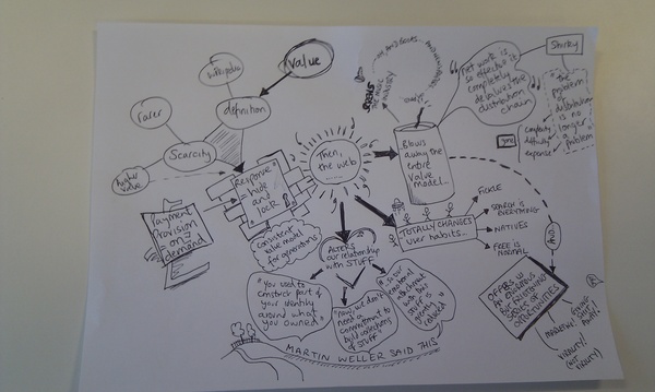
This MindMap from Flickr courtesy of Mike Ellis from http://electronicmuseum.org.uk . The mindmap approach was designed originally and championed by Tony Buzan. Mind mapping is a thinking tool which can also be used for formally to record information spaces and to manage workflows. Its worth looking at the Buzan web site as a follow up, mindmaps may be drawn by hand or using software, and there are many tools available which can be used to create mind maps on computers. The diagram linked from in the Radar Diagram (below) provides an interactive snapshop of mapping software 

you probably already know about the following, but do some web searching if you are in doubt!
  • Venn Diagram
  • Cluster Diagram
  • Layer Chart
  • Concentric Circles

Radar


Picture 13.png


from
http://www.visual-literacy.org/pages/maps/mapping_tools_radar/radar.html

Compound Visualisations:

According to the visualisation periodic table, there are six types of compound visualisations - although I think that if you go to Tufte he identifies quite a few which have been generated with firm mappings to their data source.
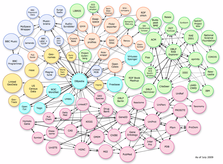
 

Knowledge Map
These are basically hypothetical maps (often in the style of maps created by early mariners) which seek to demonstrate the 'landscape'. They also remind me in style of maps which accompany books like The Lord of the Rings and Swallows and Amazons.


You probably need a great deal of imagination to create a convincing knowledge map, but they can be highly persuasive and powerful in communicating an overview of content and issues in a particular area.


I find label knowledge maps a little misleading, and wonder if mythical maps, or metaphor maps might be more accurate. To me the term knowledge implies a degree of certainty and finality which I do not think is actually communicated in the final product.


I have come across a couple of knowledge maps which are probably of interest to folks in my research area.


Knowledge Map


webmap.png


Permanent link to this comic: http://xkcd.com/256/

Image URL (for hotlinking/embedding): http://imgs.xkcd.com/comics/online_communities_small.png

eLearnland


elearnland.png


Learning Map


early work in this area was done by companies seeking to explain the intricacies of their organisaiton. Probably the most famous is the work done by Pepsi on Beverage Street. There is a paper which explores this work The Learning Map Approach by James Haudan and Christy Contardi Stone, a white paper published in The Change Handbook, Peggy Holman, Tom Devane and Stevan Caddy. Here the approach is one of metaphor rather than formal modelling, although it may be possible to incorporate meaning via metaphor, such as sense of proximity and distance, known and unknown.


LearningMapinformal-learning.jpg


from
http://elearningargentina.files.wordpress.com/2008/03/informal-learning.jpg

Underground Map


This is called a metro map by the folks at visual-lliteracy.org, but since the original map (a visualisation which depicts conections and interconnections, but priviledges this over scale accuracy) was designed for the London Underground, I think it is more accurate and respectful to call it an Underground Map - the paris metro map is a totally different beast!

This example visualisation of Web Trends was produced in 2007 by Otto Nassar (version 2)

WebTrendsUndergroundMap.png


According to the web site at http://informationarchitects.jp/wtm4/
"The map has been featured all across the web from .... The Web Trend Map plots the Internet’s leading names and domains onto the Tokyo Metro map. Domains and personalities are carefully selected through dialogue with map enthusiasts, and every domain is evaluated based on traffic, revenue, and character. "

Version 4 - a rather different beast is shown below


Other Stuff

Information is Beautiful

Picture 26.png

rather fabulous site to browse to gather ideas and models of information graphics

Colorschemer


if you are going to present visual information, you will need to choose decent colour schemes! take a look at http://www.colorschemer.com/blog/

visualising words and their semantic interconnections

tag cloud
just as you see on the left of this post, it offers both a mapping and a compact visual analysis of the information


"Wordle is a toy for generating “word clouds” from text that you provide. The clouds give greater prominence to words that appear more frequently in the source text. You can tweak your clouds with different fonts, layouts, and color schemes. The images you create with Wordle are yours to use however you like. You can print them out, or save them to the Wordle gallery to share with your friends".


Gallery of Data Visualization - the best and worst of statistical graphics

Gapminder is an online visualisation tool. It works with a collection of provided data sets, useful for getting an idea of what visualisations might look like.

visualcomplexity.com is a website which provides an index into many different visualisation methods and tools


The last time I looked, the main categories of visualisation were
Art (62)
 Biology (50)
 Business Networks (25)
 Computer Systems (29)
 Food Webs (7)
 Internet (30)
 Knowledge Networks (105)
 Multi-Domain Representation (60)
 Music (33)
 Others (59)
 Pattern Recognition (24)
 Political Networks (20)
 Semantic Networks (30)
 Social Networks (89)
 Transportation Networks (45)
 World Wide Web (55)


Further reading 
 Concept Mapping with thanks to the online concept mapping resource guide http://www.socialresearchmethods.net/mapping/mapping.htm

-->

Trochim, W. Reliability of Concept Mapping. Paper presented at the Annual Conference of the American Evaluation Association, Dallas, Texas, November, 1993. 

Tukey, John W (1977). Exploratory Data Analysis. Addison-Wesley. ISBN 0-201-07616-0. OCLC 3058187.